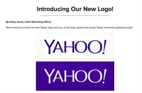
SAN FRANCISCO (AP) — Yahoo has refreshed its logo for the first time since shortly after the Internet company’s founding 18 years ago.

The new look unveiled late Wednesday is part of a makeover that Yahoo Inc. has been undergoing since the Sunnyvale, Calif., company hired Google executive Marissa Mayer to become Yahoo’s CEO 14 months ago.
Mayer has already spruced up Yahoo’s front page, email and Flickr photo-sharing service, as well as engineered a series of acquisitions aimed at attracting more traffic on mobile devices. The shopping spree has been highlighted by Yahoo’s $1.1 billion purchase of Tumblr, an Internet blogging service where the company rolled out its new logo.
The redesigned logo retains some of the elements of the old one, including the company’s official color, purple. Yahoo’s familiar exclamation point, meant to punctuate a yodeling sound that has long been the company’s calling card, is still there, too, but with a twist. When visitors come to Yahoo’s front page or an app, the exclamation point dances across some of the lettering before settling at the end of the company’s name at a slight tilt of nine degrees.
“We knew we wanted a logo that reflected Yahoo — whimsical, yet sophisticated,” Mayer wrote on her Tumblr account. She hailed the redesigned looks as “modern and fresh, with a nod to our history. Having a human touch, personal. Proud.”
Mayer, 38, said she spent most of one weekend this summer figuring out what the new logo should look like with four other Yahoo colleagues: Bob Stohrer, Marc DeBartolomeis, Russ Khaydarov, and an intern, Max Ma.
In an effort to drum up more interest in the changeover, Yahoo spent the past 30 days showing some of the proposed logos that Mayer and her helpers cast aside.
The revision is the first time that Yahoo has made a significant change to its logo since a few tweaks shortly after co-founders Jerry Yang and David Filo incorporated the company in 1995.
Since Yahoo’s logo is so recognizable, it’s a good thing they kept the changes relatively sedate, says branding expert Laura Ries, of the Atlanta firm Ries & Ries.
“One of the worst things in the world you can do is have a log around for two decades and then do something totally different. It’s quite unsettling for consumers,” she said. Keeping the purple and the exclamation point was a good idea, she said.
Mayer’s overhaul of Yahoo has attracted a lot of attention, but so far it hasn’t provided a significant lift to the company’s revenue. Yahoo depends on Internet advertising to make most of its money, an area where the company’s growth has been anemic while more marketing dollars flow to rivals such as Google Inc. and Facebook Inc.
A new logo is an important part of updating Yahoo, Ries said, but at the end of the day the company has to do a better job of “verbalizing what exactly Yahoo is.”
“There’s nothing wrong with improving something, putting lipstick on something, but at the end of the day is it a pig or not? That is the question,” Ries said.
Yahoo’s stock has climbed by nearly 80 percent, but most of that gain has been driven by the company’s 24 percent stake in China’s Alibaba Holdings Group. Investors prize Alibaba because it has emerged as one of the fastest growing companies on the Internet.
Yahoo’s stock gained 13 cents, or 0.5 percent, to $28.20 in mid-afternoon trading Thursday.


